The Arrow Trick
Why I Use It in Every Landing Page
Sasha Mozdir
Indie creator
TMPL
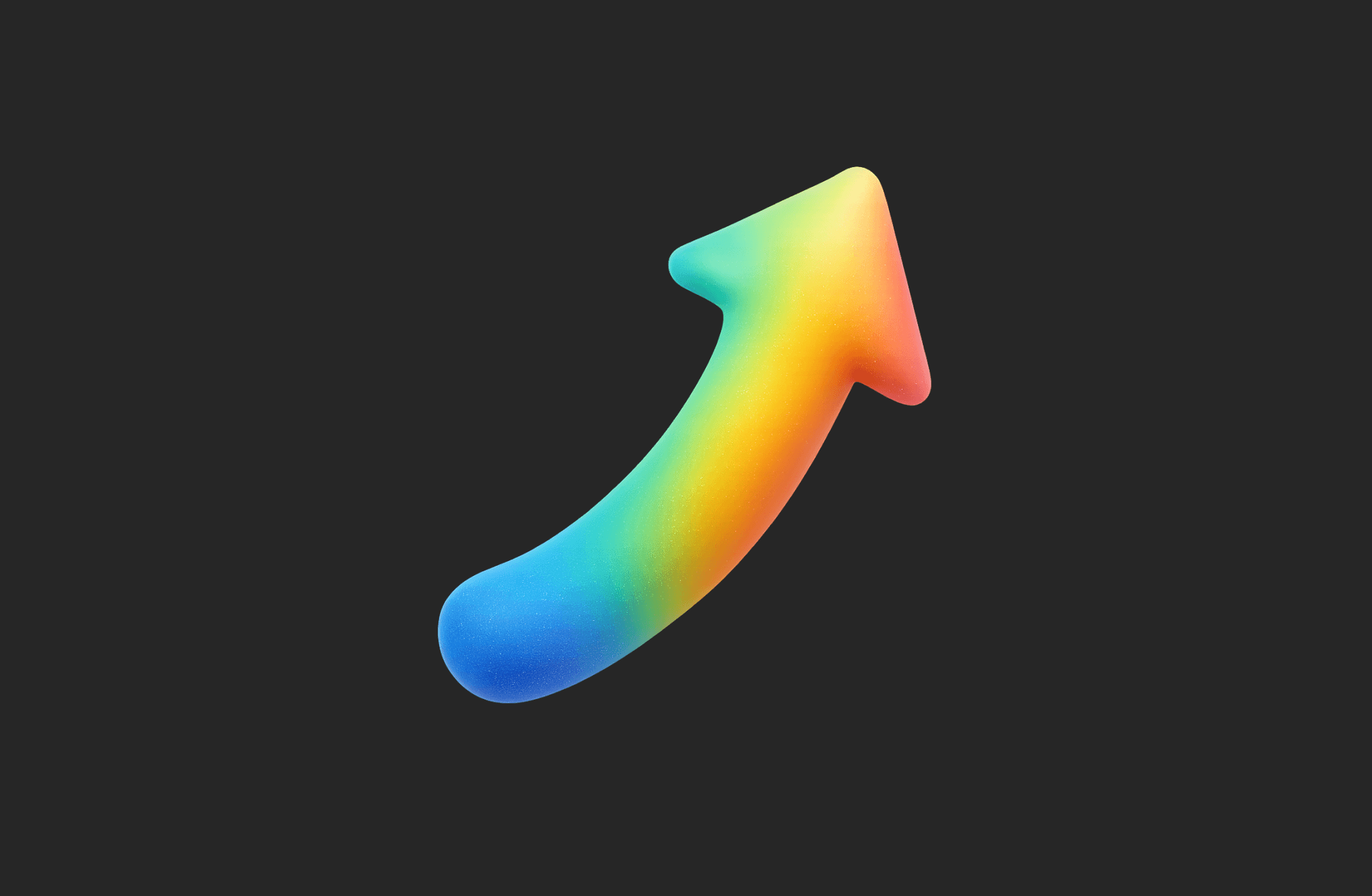

There’s one design element I keep reusing. A 3D arrow. Sounds basic. But it works every single time. Here’s why:
1. It directs the eye
People don’t read. They scan.
A well-placed arrow tells them:
👉 Look here.
👉 Scroll down.
👉 Click this.
2. It adds dimension
Flat designs are forgettable. A gradient arrow with depth adds energy - even to minimalist layouts.
3. It breaks the grid (on purpose)
Sometimes you need one bold shape that cuts through the layout and adds rhythm. Arrows do that.
Pro tip:
I use my arrows in 3 ways:
pointing at CTAs
guiding scroll
floating near headlines to add motion
Want to try it?
Make one in Framer or grab mine - fully editable, no code.